Ocean & Oak is a concept fine dining seafood restaurant based in Newport Beach, California. The brief: create a brand from the ground up that feels elevated without being cold — the kind of place that earns a Michelin mention but still makes guests feel at home. Coastal luxury. Warm materials. Seasonal menus driven by what the Pacific delivers daily.
The deliverables spanned every touchpoint: logo and brand identity, menu and packaging design, interior concept direction, food and lifestyle photography direction, website design, mobile app, and social media content.
Before — The Problem
The founders had a concept but no visual language. Their initial reference deck was a collection of inconsistent references — some nautical (too cliché), some dark and masculine (too cold), some Mediterranean (wrong geography). The name was decided. Everything else was an open canvas with no direction.
Without a visual system, the restaurant risked looking like dozens of other upscale coastal concepts — generic enough to be forgettable the moment guests stepped outside.
After — The Outcome
A complete brand ecosystem built around the concept of refined coastal restraint — where quality speaks through texture and silence rather than noise and decoration. The colour palette draws from Pacific fog mornings: deep slate, warm ivory, aged bronze, and ocean kelp green. Typography pairs a high-contrast serif for headlines with a humanist sans-serif for body copy — formal but approachable.
The result is a brand that photographs beautifully, reads clearly on both print and digital, and communicates immediately that this is a restaurant that takes its craft seriously.
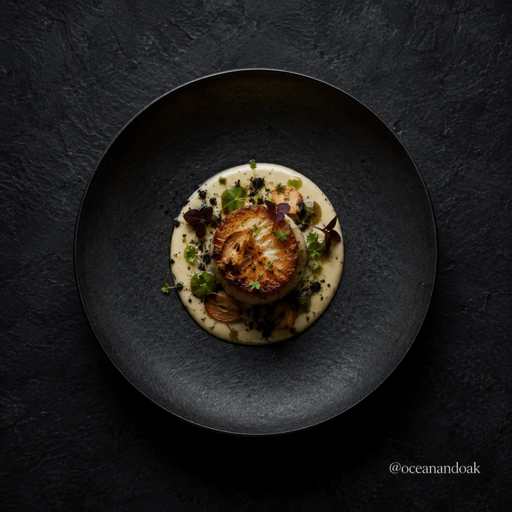
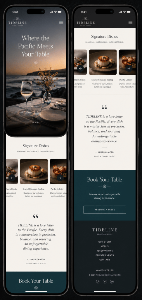
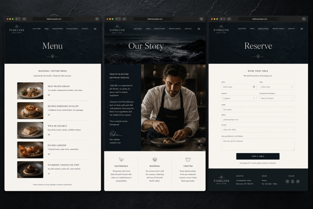
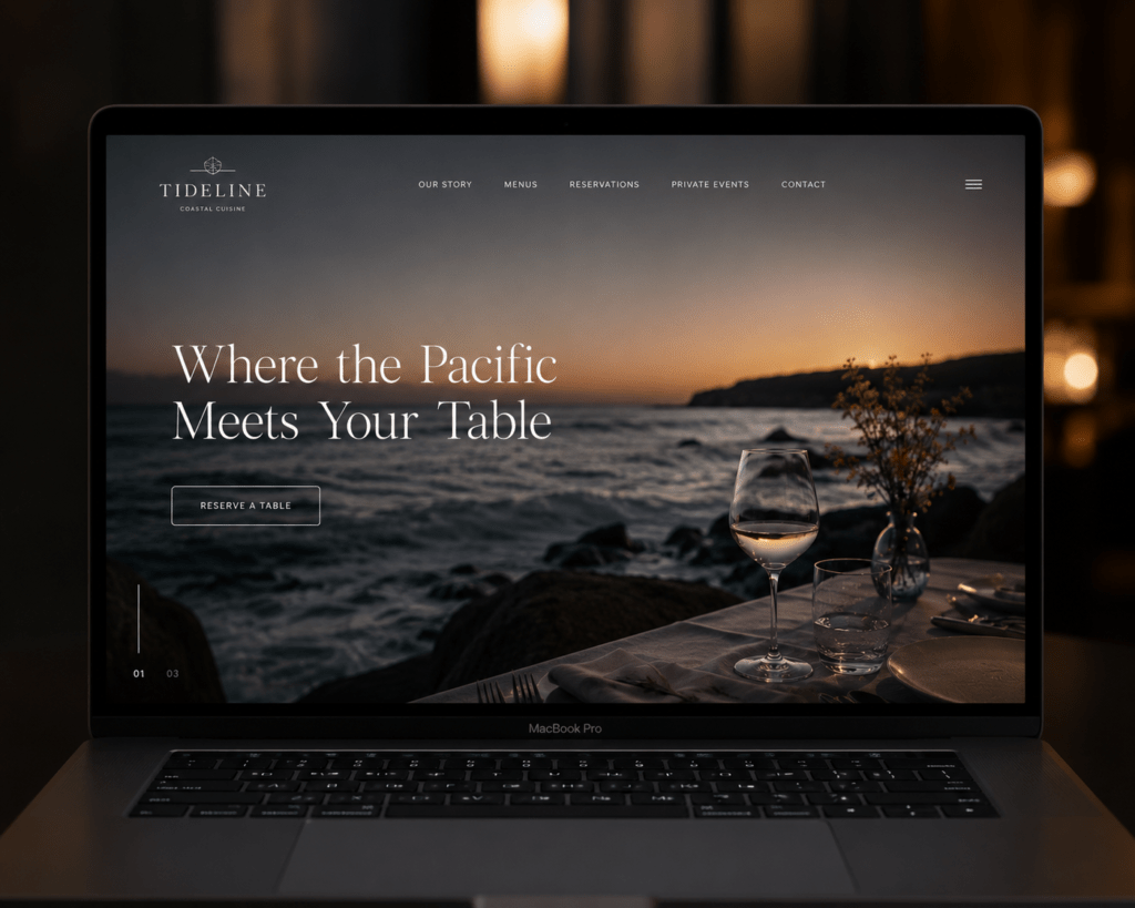
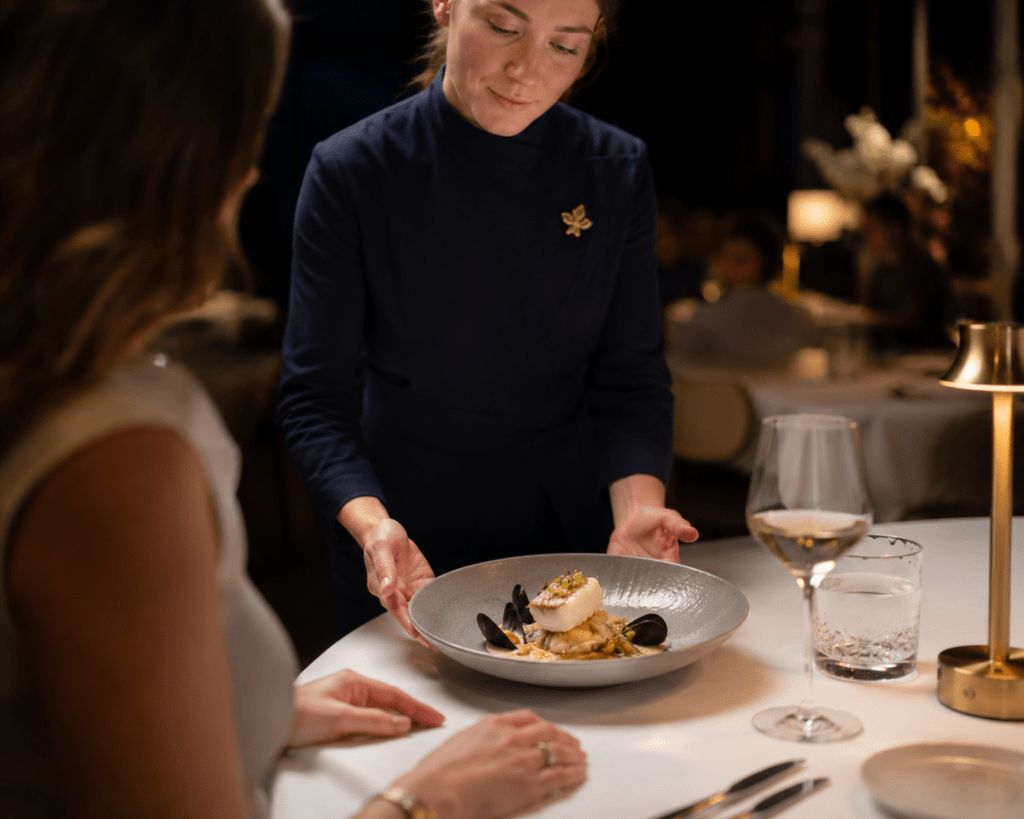
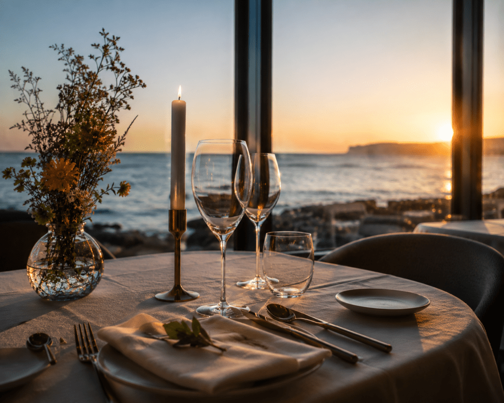
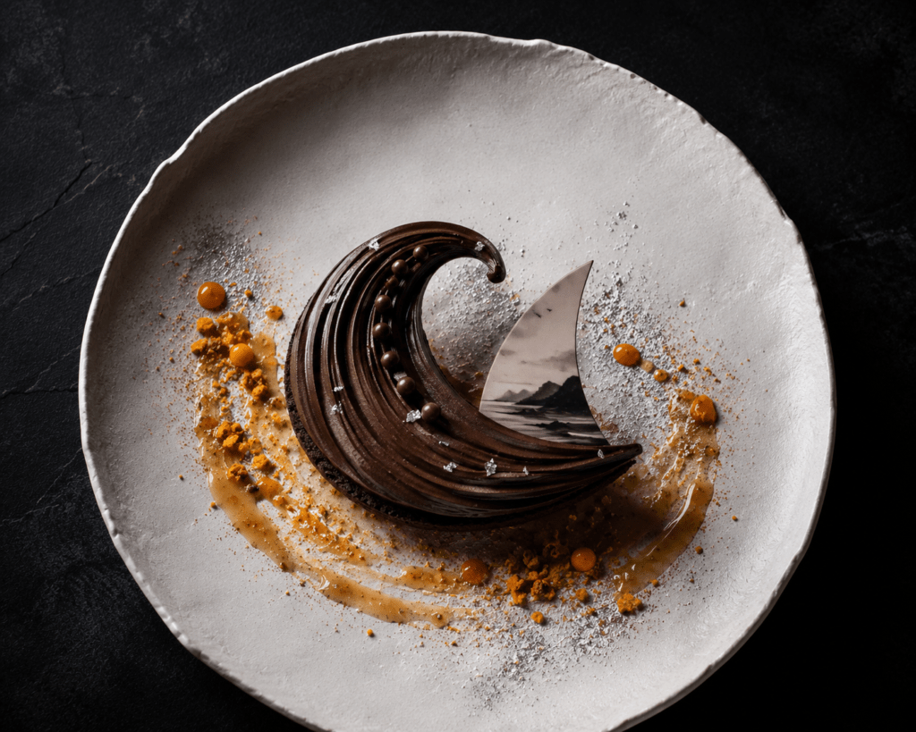
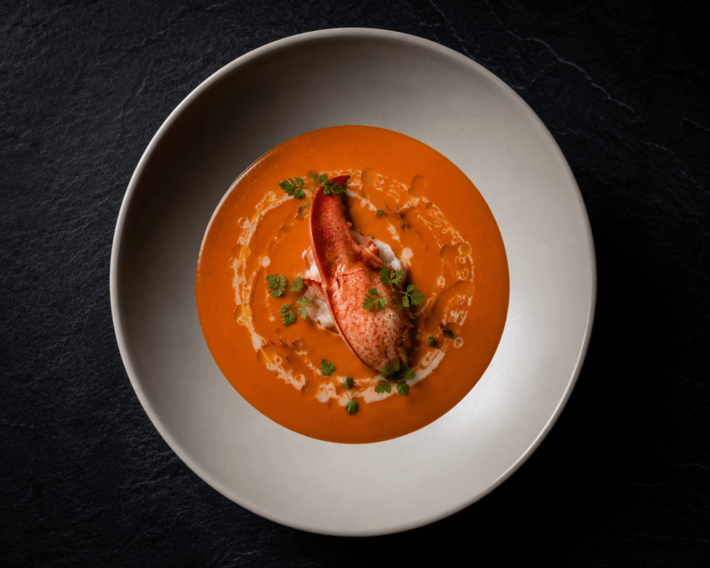
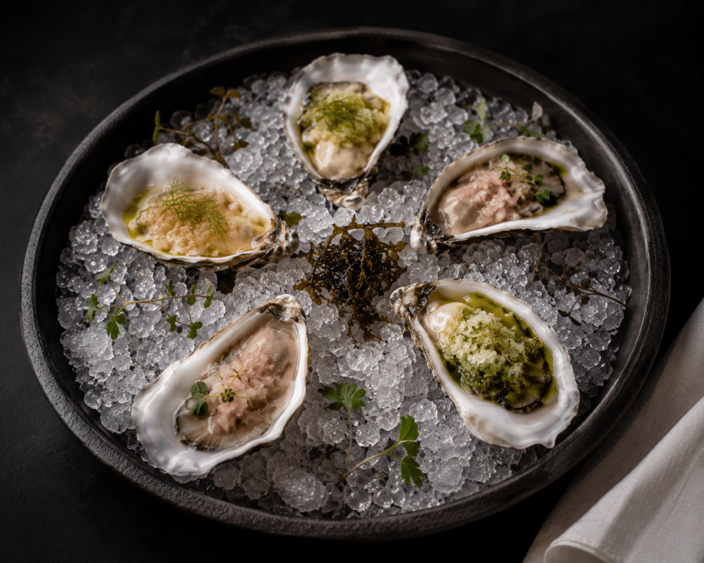
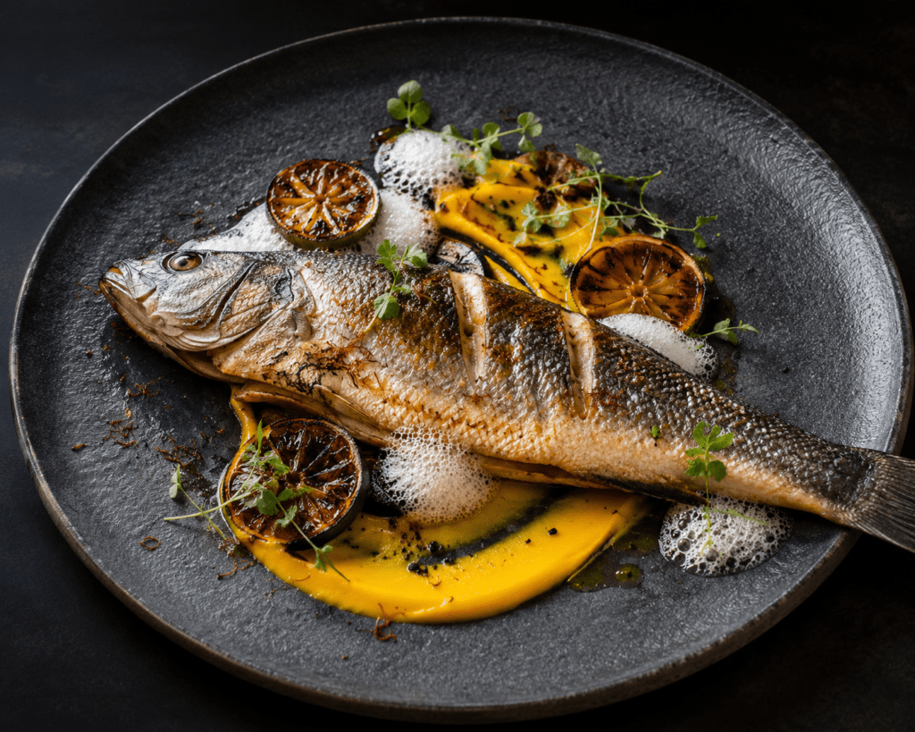
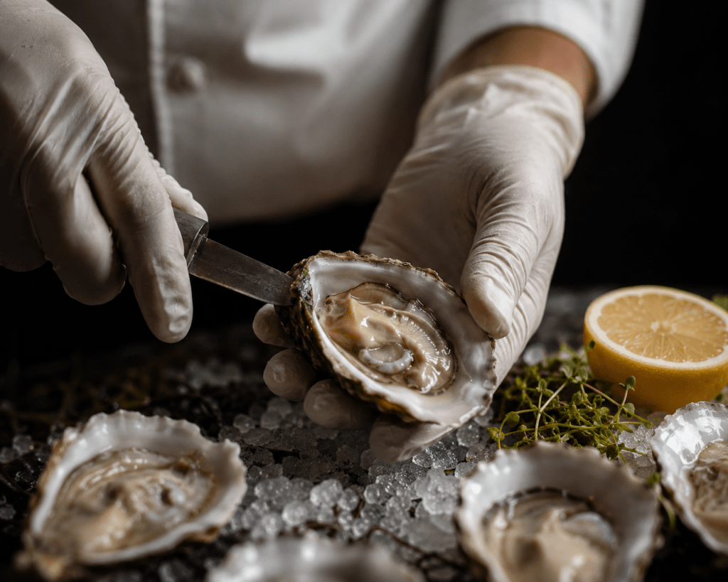
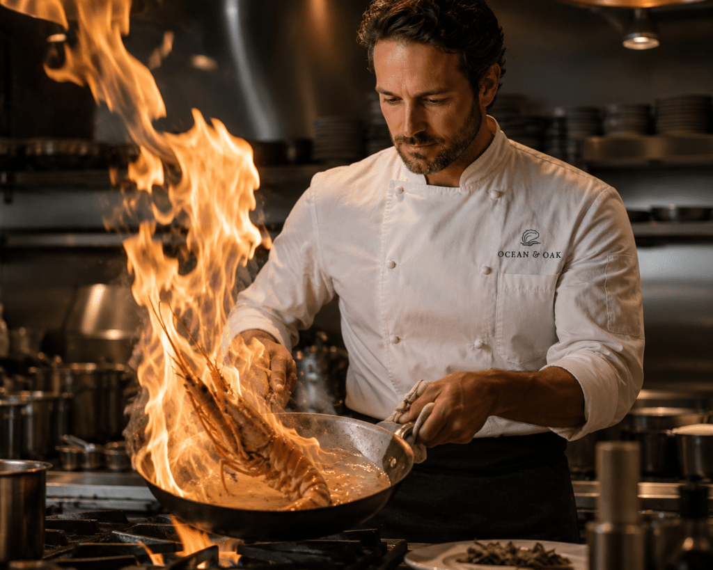
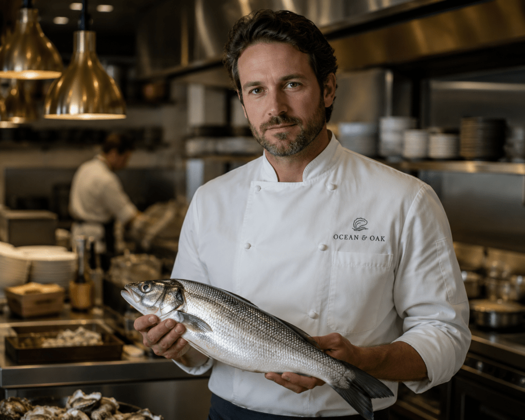
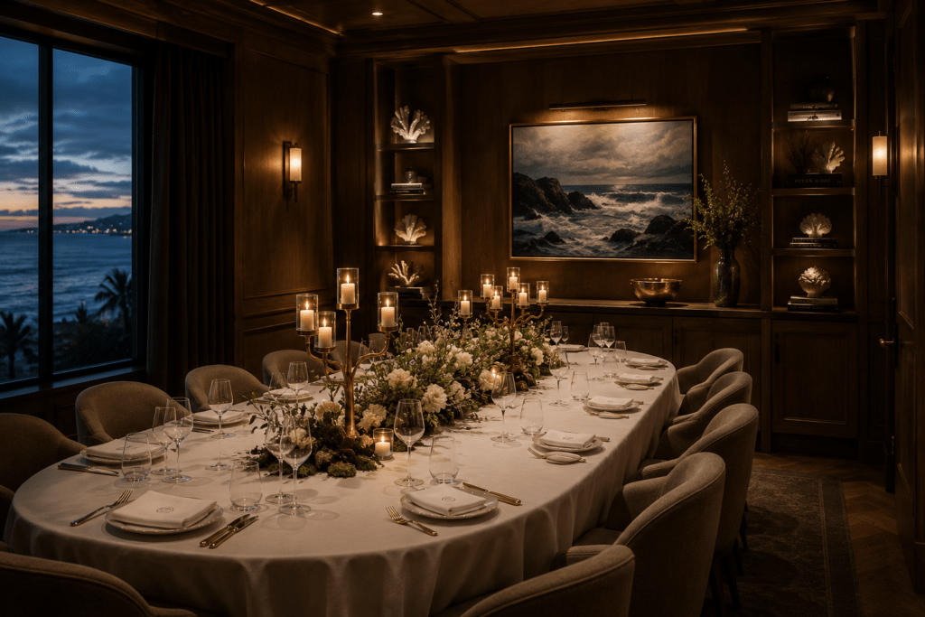
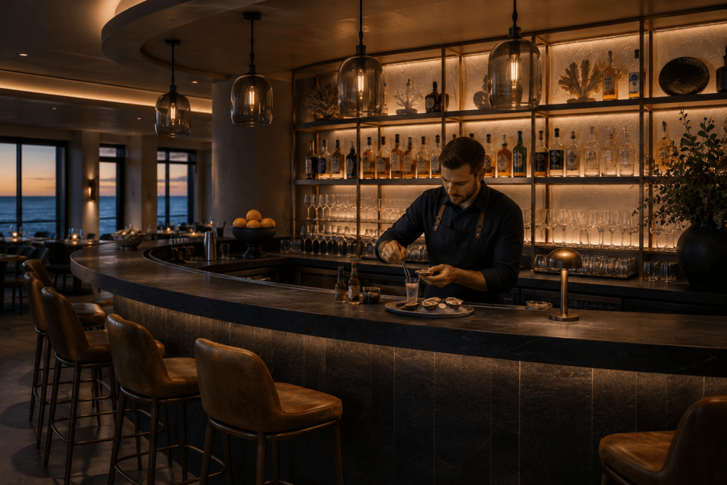
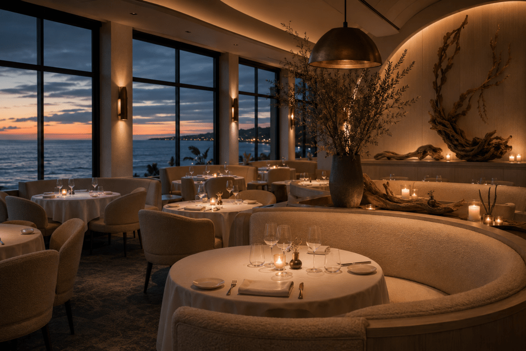
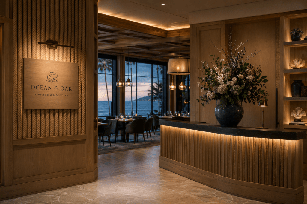
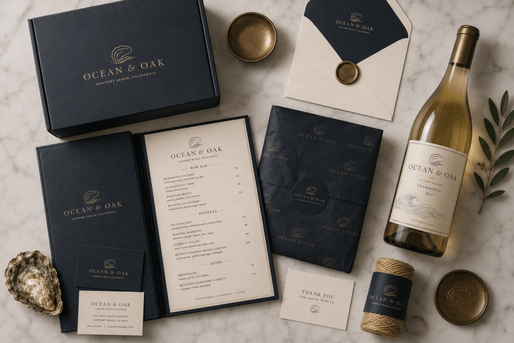
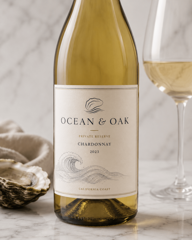
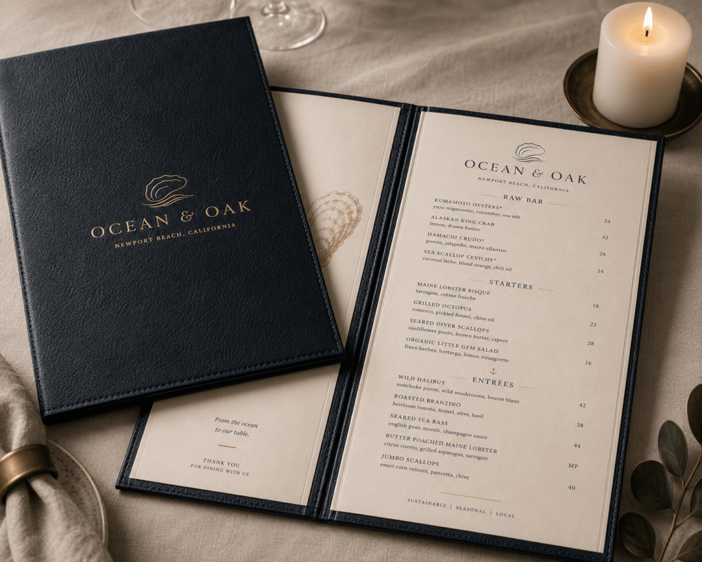
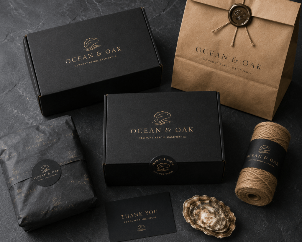
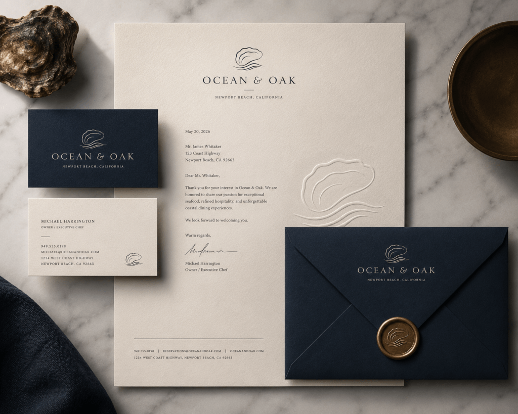
The Ocean & Oak project is a demonstration of what happens when every brand touchpoint is designed from a unified creative brief rather than assembled piece by piece. The menu, the packaging, the app, the Instagram story, and the dining room interior all speak the same visual language — and the guest who discovers the brand on social, makes a reservation on the app, and sits down for dinner experiences a consistency that communicates craft at every moment.
That’s the difference between a restaurant that looks the part and one that feels it.