This guide takes a different approach to the standard “best landing pages” roundup. Instead of a list of pages to admire, it’s an analysis of the principles each example demonstrates — the specific decisions that explain why they convert, and how those principles can be applied to your next page regardless of your industry or budget.
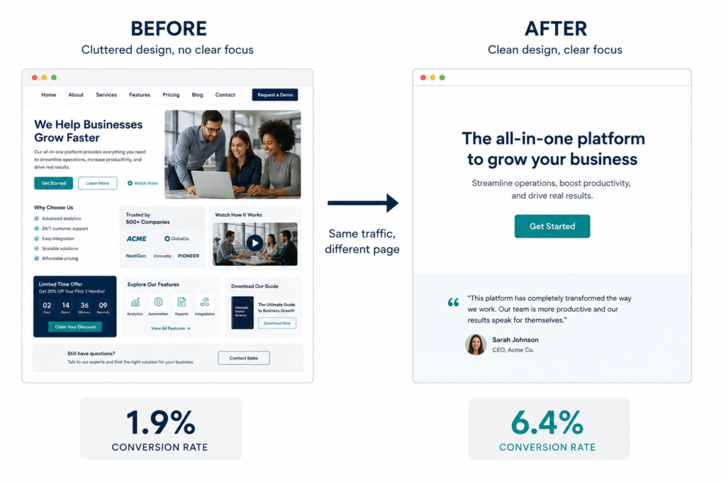
The difference between a landing page that converts and one that doesn’t is almost never about design quality. It’s about whether the page does the specific job it exists to do — clearly, quickly, with the minimum possible friction.
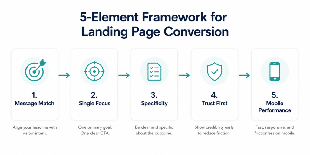
The highest-converting landing page examples share five traits: a clear, specific headline; a single primary CTA; immediate visual hierarchy; trust signals such as testimonials, customer logos, or stats; and a frictionless form.
The average landing page conversion rate is 10.76%. An increase from 10 to over 40 landing pages means a 500% gain in conversions, especially among B2B companies. That second statistic is worth sitting with. More targeted landing pages — each one speaking to a specific audience, a specific offer, a specific traffic source — consistently outperform a single general page serving everyone.
The Conversion Fundamentals: What Every High-Performing Page Gets Right
Before the examples, the framework. The analysis of every page in this guide traces back to the same set of underlying principles. Understanding them makes it possible to evaluate any landing page — not just the ones listed here.
Principle 1: Message Match
Ensure your value proposition directly reflects the promise made in the ad or link the visitor clicked. If your ad promoted “fast e-commerce websites”, your landing page must echo that exact value.
Message match is the principle most frequently violated, most easily fixed, and with the most immediately measurable impact on conversion rates. A visitor arrives with a specific expectation set by the ad, email, or link that brought them. If the landing page headline doesn’t confirm that expectation within five seconds, they leave.
The test is simple: read your ad. Read your landing page headline. Do they describe the same thing in the same terms? If there’s a gap — even a small one — that gap is costing you conversions.
Principle 2: Single Focus, Zero Distractions
Minimizing the distractions on your page could boost conversions by 10%.
Every navigation link, every related article suggestion, every secondary CTA is an exit route. A landing page with a navigation bar gives visitors ten ways to leave before converting. Remove them all. The page has one job: drive one specific action. Every element on the page should either support that action or be removed.
Principle 3: Specificity Beats Vagueness in Every Element
“Thousands of satisfied customers” tells visitors nothing useful. “Increased conversion rates by 47% in 60 days using our email segmentation feature” tells visitors exactly what to expect. Collect testimonials with specific, quantified results. Require full names, professional photos, and job titles.
This principle extends beyond testimonials to every copywriting decision on the page. Specific headlines outperform vague ones. Specific benefit descriptions outperform generic ones. Specific CTAs (“Start your 14-day free trial”) outperform generic ones (“Learn more”). Every vague element is an opportunity to be more credible and more persuasive.
Principle 4: Trust Must Be Earned Before the Ask
The order of information on a landing page is as important as the information itself. The conversion ask — the form, the button, the purchase — should come after the trust has been established. Present the problem, establish the solution, demonstrate that others have succeeded, then ask for the action.
In digital marketing with overpromising brands, social proof is the deal breaker.
Principle 5: Mobile Performance Is Not Optional
As of 2026, a vast majority of landing page traffic — over 80% — can come from mobile devices. Among top landing pages, 86% have been optimised for mobile. Every second of mobile load time increase costs visitors and conversions. Test every landing page on a real mobile device before it goes live.
Category 1: SaaS and Software Landing Pages
Netflix — The Simplest Page for the Most Complex Product
If you were to design a landing page for a product that needs to explain streaming, subscriptions, device compatibility, content libraries, and pricing — you’d probably end up with a lot of copy. Netflix does the opposite.
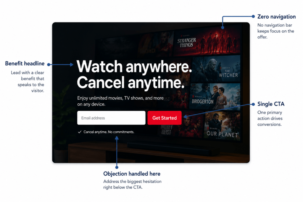
Their sign-up landing page is one of the most studied in conversion optimisation for a reason. Headline copy tests on Netflix’s page have compared benefit-led (“Watch anywhere, cancel anytime”) versus urgency-led (“Start watching tonight”), and trust copy position — “Cancel anytime” before the CTA versus after it — and CTA button text variations including “Get Started” versus “Start Watching.”
What the Netflix page gets right is that it answers the most important question for a hesitant visitor — not “how does this work?” but “what could stop me from cancelling if I regret this?” — by putting “Cancel anytime” directly below the CTA. That micro-trust element removes the primary objection at the exact moment the visitor is deciding whether to click.
The page removes navigation entirely. The email form is the only field. The CTA is in the brand’s signature red, impossible to miss. The background image shows content — not the product interface, but the experience the product enables.
The takeaway: Your landing page’s job is to reduce the visitor’s perceived risk of converting, not to explain every feature. Identify the single biggest reason someone wouldn’t convert and address it directly, adjacent to the CTA.
Slack — Repositioning Through a Landing Page
Slack’s most instructive landing page isn’t their homepage. It’s the page where they repositioned the product from “chat tool” to “mission-critical business software.”
Slack’s page doesn’t just make claims; it backs up the repositioning with strong social proof and case studies from real customers. Seeing recognisable logos and reading success stories helps visitors trust the repositioning. The conversational yet confident tone invites the reader to envision a more productive workplace with Slack at the centre. It’s a masterclass in using landing page content to change how your audience thinks about your solution and why they need it.
The insight here is that landing pages don’t have to be purely transactional. For products with a perception problem — where the visitor’s mental model of the product is less sophisticated than what the product actually delivers — a well-constructed landing page can shift that perception while simultaneously driving conversion.
The mechanism: introduce the expanded vision, immediately validate it with enterprise social proof that the visitor can’t argue with, and provide a clear path to experiencing that vision themselves.
The takeaway: If your product is consistently undersold by how your prospects describe it to each other, a dedicated repositioning landing page — with specific enterprise proof rather than generic testimonials — can shift that perception and increase deal size alongside conversion rate.
Dropbox — Benefit Clarity Above Everything
Dropbox offers a straightforward benefit: “Everything you need for work, all in one place.”
Dropbox’s landing pages are studied not for visual innovation or copywriting craft but for discipline. The page does not overreach. It does not try to explain every feature. It does not use complex visual metaphors for cloud storage.
Opportunities identified on Dropbox’s page include: more outcome-driven headlines (e.g. “Access your files anywhere, instantly”) versus feature-led messaging; showing real product UI previews instead of abstract visuals to reduce uncertainty; and testing different CTA phrasing (“Start storing files,” “Try Dropbox free”) for motivation clarity.
Even a page this disciplined has optimisation opportunities — the principle being that there’s always a gap between where a page is performing and where it could be. The Dropbox example is instructive precisely because it shows that even simple, well-designed pages benefit from continuous testing.
The takeaway: Clarity consistently outperforms cleverness on landing pages. If the benefit of your product can be stated in six words, state it in six words. The visitor’s mental bandwidth for processing marketing messages is smaller than you think.
Miro — The Interactive Demo as Hero
Miro pulls users in with an interactive product demo right at the top. It addresses the problem and shows how the tools work without needing to scroll.
For complex software products where the primary conversion barrier is “I don’t fully understand what this does,” an interactive demo embedded at the top of the landing page removes the barrier more efficiently than any amount of copy.
The insight behind Miro’s approach: don’t describe the value, demonstrate it. A visitor who has spent 90 seconds inside the product — even a simplified demo version — has formed a real sense of what it could do for them. That experiential understanding converts far better than conceptual description.
The takeaway: For products where the value is clearer in use than in description, the most persuasive element of your landing page is a direct experience of the product. Interactive demos, short walkthrough videos, or annotated screenshots of the interface working achieve this more efficiently than feature lists.
Category 2: B2B and Lead Generation Pages
Salesforce — Data-Driven Social Proof for a Data-Driven Audience
The minimalistic Salesforce layout — no clutter, just a hero statement and a few bullets of proof — highlights the message that Salesforce delivers results, and that’s a compelling pitch. Data-driven social proof like this can be incredibly persuasive on B2B pages, where decision-makers want to justify their choice with facts.
Salesforce’s B2B landing pages are a study in matching the social proof format to the audience’s decision-making style. B2B buyers — particularly in enterprise contexts — justify their decisions with data. They need to present their choice to a committee, defend it to a CFO, and articulate the ROI before signing.
A landing page that speaks to that justification process — providing the specific numbers, the recognisable customer names, the industry-relevant outcomes — is a page that removes the internal barriers that sit between a prospect’s interest and their signature.
The takeaway: The social proof on your landing page should be designed for the person who will have to justify your solution to someone else. Make their argument for them. Give them the numbers, the names, and the outcomes before they have to ask for them.
Belkins ROI Calculator — Interactive Value Before Contact Details
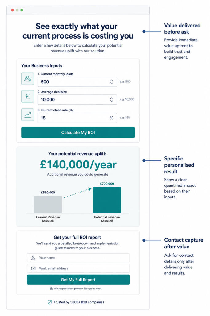
Michael Maximoff from the Belkins team shares: “Our ROI Calculator landing page is our highest-performing landing page, and 30% of our website conversions come from this page alone.”
The Belkins ROI Calculator page is one of the most commercially instructive examples of lead generation page design in recent years. Instead of asking the visitor to trust claims about the service’s value and then submit their details, it delivers personalised value first — the visitor inputs their current numbers, sees their potential uplift, and then, with that specific data in front of them, is invited to connect.
This reversal of the typical page structure — value before ask, not ask before value — produces dramatically higher quality leads because the visitor who submits after seeing their ROI calculation is already sold on the concept. The sales conversation starts from a position of established interest rather than cold enquiry.
The takeaway: Interactive tools that deliver personalised value before asking for contact information convert higher-quality leads than static lead magnets. If you can build a calculator, an assessment, or a diagnostic tool that gives the visitor a relevant, specific output — and then capture their details as part of delivering it — your lead quality will improve alongside your conversion rate.
Intercom — When B2B Breaks the Single-CTA Rule
Conventional wisdom says a landing page should have one single CTA and no external links, but Intercom shows that in B2B, sometimes you have to break the rules carefully.
Multiple CTA options matching buyer journey stages perform better than single-action pages for complex B2B purchases. Offer both “Start Free Trial” for ready-to-evaluate prospects and “Schedule Demo” for those requiring guided evaluation.
The Intercom example is important because it illustrates a nuance that most landing page guidance misses: the single-CTA rule is most important when the conversion is simple. For complex B2B products with long sales cycles and multiple decision-makers, a visitor landing on a page might be at any of several stages in their evaluation process. Offering two paths to conversion — self-service and guided — captures more of the intent spectrum than forcing everyone down a single path.
The critical distinction: both CTAs lead to conversion. Neither is a distraction. The choice is between two flavours of “yes,” not between “yes” and “let me browse your blog.”
The takeaway: In complex B2B sales, consider whether you’re losing high-intent visitors who want a demo by only offering a free trial, or losing self-service-ready visitors by only offering a demo. Two conversion paths serving different readiness stages is a sophisticated approach to matching page structure to buyer journey reality.
Category 3: E-Commerce and Consumer Landing Pages
Airbnb Host Sign-Up — Making Long Forms Feel Short
Airbnb’s host signup page demonstrates how to make a longer form feel shorter by structuring what you ask for and when. The page has a lot of information on it, but it never feels overwhelming. Signup form with 3 visible fields, with optional fields hidden under a tab — visitors see a short form, not a long one. Resources section addresses common concerns about hosting without requiring the visitor to navigate away. Community proof shows how other people use the service, which helps hesitant visitors see themselves as potential hosts. Support visibility removes the “what if something goes wrong?” fear.
The Airbnb host page is a masterclass in friction reduction for high-commitment conversions. Becoming a host is a significant decision — it involves opening your home to strangers. The landing page addresses every psychological barrier to that decision without requiring the visitor to navigate away to find answers.
The form design is particularly instructive. Three visible fields make the initial commitment feel small. Optional additional fields hidden under a tab allow hosts who want to add more detail to do so without imposing that complexity on those who don’t. The form looks like three fields even when it’s ten.
The takeaway: For high-commitment conversions, your job is to make the decision feel smaller and the risk feel lower — not to collect all the information you might ever need before the first interaction. Collect the minimum required to start the relationship, and gather more information after the initial conversion.
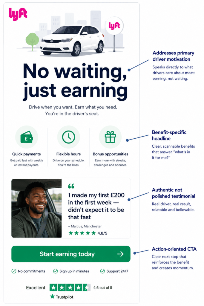
Lyft Driver Sign-Up — Speaking Directly to Motivations
The Lyft driver landing page is a fantastic example of direct, benefit-oriented design that speaks directly to its target audience. It expertly addresses the key motivations and concerns of potential drivers, making the value proposition clear and compelling from the very start. The headline and supporting copy immediately get to the point, highlighting the most important selling points: quick payments and increased income. This speaks directly to some of the primary reasons someone would consider driving for Lyft, capturing their interest instantly. Lyft features real quotes from their drivers.
The Lyft driver page is instructive because it demonstrates audience specificity at the headline level. The page isn’t trying to explain what Lyft is — it assumes the visitor knows. It’s answering the specific question that a potential driver is asking: “Is this actually worth my time?”
Every element of the page — the headline, the testimonials, the benefit bullets — is written from the perspective of a potential driver’s decision-making process, not Lyft’s business priorities. The authentic driver quotes are deliberately informal and recognisably genuine — not marketing copy masquerading as a testimonial.
The takeaway: Write your landing page from inside your visitor’s decision-making process, not from inside your business’s communication priorities. What is the primary question they’re asking when they arrive? Answer that question first.
Codecademy — Making the Intimidating Feel Achievable
Codecademy is the perfect example of a landing page for businesses that offer products where the customer’s primary barrier is their own self-doubt about whether they can succeed. It makes the intimidating world of coding feel approachable for beginners thanks to its copy. It also includes success stories, testimonials, and other forms of social proof to further sell the course.
The Codecademy landing page tackles a conversion barrier that most CRO guides don’t discuss: the visitor who wants the outcome but doesn’t believe they’re capable of achieving it. The page doesn’t just sell the course — it sells the visitor’s capability of completing it.
The social proof strategy is calibrated to address this barrier. The testimonials aren’t “Codecademy is a great product.” They’re “I had never coded before, and now I work as a developer.” The proof is about transformation, not satisfaction. It’s specifically designed to make the hesitant beginner see themselves in the success story.
The takeaway: Identify your visitor’s actual barrier to converting. For many offers, it’s not “I don’t understand the product” — it’s “I don’t believe I can succeed with it.” Social proof that demonstrates transformation from a starting point the visitor recognises is more persuasive than proof that demonstrates satisfaction.
Category 4: Lead Magnet and Content Pages
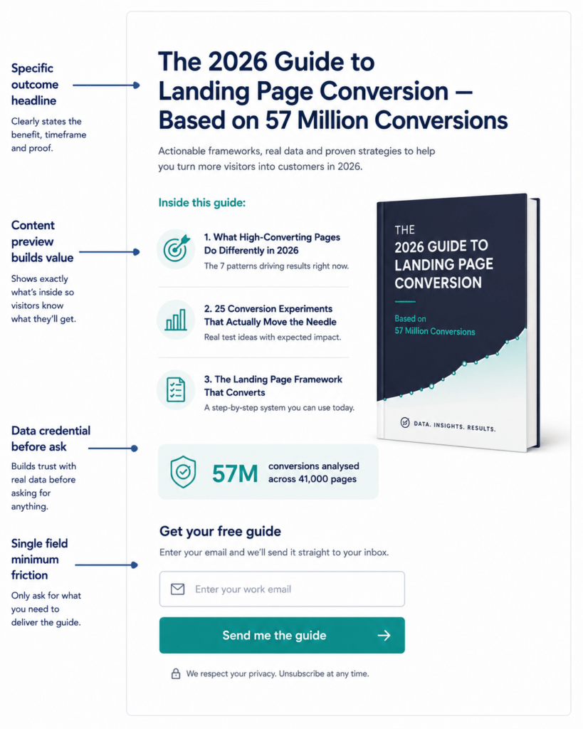
HubSpot Lead Magnet Page — The Ebook That Still Works
55% of HubSpot’s top landing page submissions came from offering ebooks (as opposed to webinars, kits, etc.). Ebooks and comprehensive guides continue to be effective lead magnets in 2025.
What makes HubSpot’s lead magnet landing pages consistently effective isn’t the ebook format — it’s the specificity of the offer and the proof that the content is worth downloading before the visitor commits.
Statistics as proof — data points about conversion results give the ebook credibility before the visitor downloads it.
The structure: a benefit-led headline that describes the specific outcome the guide enables, a short description of what’s inside that’s specific enough to be credible, one or two data points that justify the resource’s authority, and a minimal form — typically just email address — for access.
The takeaway: The perceived value of a lead magnet is determined before the download, not after. Use statistics, preview content, and specific outcome descriptions to establish the value of what you’re offering before you ask for contact details. The less friction in the form, the less justification you need for the value.
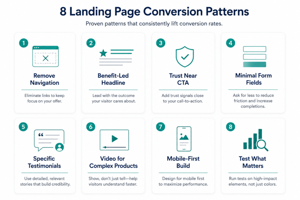
The Eight Conversion Patterns That Appear in Every High-Performing Page
Across all twelve examples above, eight structural decisions consistently separate high-converting pages from average ones. These are the patterns worth extracting and applying directly.
1. Navigation Removed
Airbnb’s homepage offers multiple external links targeted for a broader audience. While its landing page for host sign-ups removes the navigation bar and offers only targeted messaging.
Every navigation link is an exit route. Removing navigation from landing pages is one of the most consistently validated CRO improvements. Do it on every dedicated landing page.
2. Benefit-Led Headline, Not Feature-Led
The headline should state the outcome the visitor gets, not the mechanism that delivers it. “Watch anything, anywhere, cancel anytime” sells the freedom. “Access to thousands of streaming titles” sells the catalogue. Freedom converts better than catalogue.
3. Trust Signal Placement Adjacent to the CTA
The moment of maximum hesitation is immediately before the click. A testimonial, a rating, a customer count, or a “cancel anytime” micro-copy element placed directly adjacent to the CTA button reduces that hesitation at the moment it matters most.
4. Form Field Minimisation
Open your highest-traffic landing page and count your form fields. If you have more than four, remove the non-essential ones immediately and collect additional qualification data through post-conversion follow-up.
Every additional field reduces completion rate. Collect only what you need to have a productive first interaction. Gather more later.
5. Specific Testimonials With Attribution
Real scarcity drives action. Fake scarcity destroys trust. Your visitors can tell the difference. The same applies to social proof. Specific, attributed testimonials with full names, job titles, and quantified outcomes convert better than vague endorsements from anonymous sources.
6. Video Where Complexity Exists
Landing pages with video can increase conversions by 86%. For products that are difficult to explain in copy, a short demo video resolves the comprehension barrier more efficiently than any amount of text.
7. Mobile-First Build
Mobile’s worldwide market share year-on-year by December 2025 was 54.23% compared to desktop’s 45.77%. Test your page on a real phone before it goes live. The mobile experience is the primary experience for most of your visitors.
8. A/B Testing on the Elements That Move the Needle
Focus your testing on elements that actually move the needle: headlines targeting different pain points, lead magnet formats, social proof approaches, and form layouts. Only 1 in 8 A/B tests produces a statistically significant result, so prioritise tests that could genuinely change how visitors perceive and interact with your offer — not cosmetic tweaks.
Test the things that change what the page means to the visitor. Not button colours — headline propositions.
Conversion Rate Benchmarks: What “Good” Looks Like by Industry
Understanding what you’re aiming for changes how you evaluate your page’s performance.
Legal Services convert at 7.4% — high intent, short decision cycles, and a compulsory-feeling need all drive strong conversion. Healthcare converts at 3.0–4.2% — trust barriers and compliance requirements keep rates moderate; top performers reach 8–10%. E-commerce converts at 4.3% — transactional audiences convert well; limited-time offers and discount pages push rates higher. Financial Services and Insurance convert at 1.7–2.3% — complexity of information and long decision processes weigh on conversion.
The cross-industry median landing page conversion rate is 6.6%, with industry medians ranging from 3.8% (SaaS) to 12.3% (the top-performing industry). The gap between average and great is enormous, and small changes in landing page design can make significant differences.
These benchmarks matter because they calibrate ambition correctly. A 2% conversion rate on a B2B enterprise software page is not a failure — it’s competitive. A 2% conversion rate on a local emergency service page is well below the 7.4% benchmark and represents a significant opportunity.
The benchmark also shapes what you test. If your conversion rate is significantly below industry median, the priority is structural — message match, navigation, form friction. If you’re at or above median, the optimisation shifts to more specific elements — headline variants, testimonial formats, CTA positioning.
Common Mistakes That Undermine Landing Page Performance
These are the failure modes that appear most consistently across the landing pages we audit — and the ones responsible for most of the gap between a page’s current performance and its potential.
Message mismatch between ad and page. The most common and most damaging mistake. Make sure your headline aligns with the campaign copy that led the visitor to your landing page. A visitor who clicked an ad about “free website audit” and lands on a generic agency homepage has already been told the page isn’t what they expected.
Navigation left in. Leaving the main site navigation on a dedicated landing page is one of the most reliably conversion-limiting decisions. Every navigation link is an exit. Remove all of them.
Generic, unattributed testimonials. “Great service, really happy with the results” from “— Sarah M.” tells visitors almost nothing. It reads as fabricated, or at best as too generic to be credible. Specific, attributed, quantified testimonials are worth ten vague ones.
Too many form fields. The instinct to collect more information is understandable but consistently counterproductive. Collect additional qualification data through post-conversion follow-up rather than at the point of initial conversion. The barrier to entry determines how many leads you get. The follow-up determines how much you learn about them.
Stock photography of models. Use high-quality, relevant imagery: ditch generic stock photos. Use authentic images of your product, your team, or your customers. Visitors process visual authenticity faster than they process copy. Stock photography of strangers shaking hands undermines the credibility that the rest of the page is working to build.
No urgency or scarcity where it’s genuine. Real scarcity drives action. Fake scarcity destroys trust. If your offer genuinely has a time limit or capacity constraint, communicate it honestly. If it doesn’t, don’t manufacture one — visitors are adept at detecting artificial urgency, and when they detect it, they distrust everything else on the page.
Testing cosmetic changes before structural ones. Button colour is not a high-leverage A/B test if your headline doesn’t match the ad that brought the visitor. Fix structural problems before testing cosmetic preferences.
Expert Observations: What Consistently Separates High-Performing Pages
After auditing and iterating on landing pages across enough industries to see consistent patterns, a few observations that don’t always make it into standard CRO guides:
The first five seconds determine most outcomes. If your headline doesn’t confirm the visitor’s expectation and establish why the page is relevant to them within five seconds, the conversion is almost certainly lost. Everything below the fold serves visitors who have already been won by the above-fold experience.
Specificity is a trust signal in its own right. A page that knows exactly who it’s for, what they need, and what the outcome will be signals a level of expertise and understanding that generic pages don’t. Specificity communicates “we understand your situation” in a way that broad positioning cannot.
The testimonial is your most powerful copywriting asset. A genuine testimonial from a customer who describes their exact situation before using your product, the specific problem it solved, and the quantified outcome they achieved is more persuasive than any headline you can write. It’s a story the visitor can see themselves in — told by someone who isn’t trying to sell them.
Post-conversion experience affects future landing page performance. A visitor who converts and has a poor onboarding experience will write a negative review, increasing the social proof problem for your landing page. The landing page is the start of the relationship — its performance compounds with the quality of what follows.
AI-generated landing pages are changing the baseline. AI-generated landing pages have a 37% higher conversion rate than control pages. This isn’t because AI writes better copy — it’s because AI-assisted generation allows faster iteration, more variants tested simultaneously, and better matching of page content to traffic source. The competitive implication is that teams using AI for landing page creation and testing are moving faster than those that aren’t.
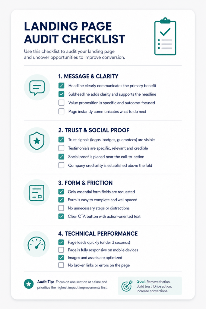
The Landing Page Audit Checklist: Evaluating Any Page in 15 Minutes
Use this checklist on any landing page — yours, a competitor’s, or a new page before it goes live.
Message and Clarity:
- Does the headline match the ad or link that brought the visitor?
- Is the value proposition clear within five seconds of arrival?
- Is there one primary CTA and no competing actions?
- Has navigation been removed?
Trust and Social Proof:
- Are testimonials specific, attributed, and quantified?
- Is social proof positioned adjacent to the primary CTA?
- Are customer logos or credibility badges present and legitimate?
- Is video used for products that benefit from demonstration?
Form and Friction:
- Does the form have four or fewer fields?
- Is there a trust statement adjacent to the submit button?
- Is the CTA button copy action-oriented and specific?
- Is the form visible without scrolling on mobile?
Technical Performance:
- Does the page load in under two seconds on mobile?
- Is the layout responsive and fully functional on a real phone?
- Are images optimised (WebP, compressed, explicit dimensions)?
- Is the CTA button above the fold on mobile?
A/B Testing:
- Have you tested at least one headline variant?
- Is there a tracking mechanism in place for conversion attribution?
- Is the test sample size sufficient for statistical significance?
Conclusion: Study Examples, But Build for Your Visitor
Landing page examples are most useful when they’re treated as demonstrations of principles rather than templates to replicate. Netflix’s minimal design works for Netflix’s audience, offer, and traffic source. The same page on a different offer with a different traffic source might convert at half the rate.
The underlying principles — message match, single focus, specific social proof, friction reduction, mobile performance — transfer across every context. The specific executions vary by audience, offer, and industry.
High-converting landing pages are built on a foundation of a single, clear goal. Utilise persuasive elements like social proof and strong headlines to build trust and urgency.
Build every landing page around one question: what is the primary reason this specific visitor, who arrived from this specific source, might not convert — and how do I remove that barrier without adding new friction?
The examples in this guide are starting points, not destinations. Use them to understand why conversion works the way it does. Then build pages that apply those principles to your specific situation, test them against the benchmarks for your industry, and iterate based on real data rather than design preference.
The gap between an average landing page and a high-performing one is rarely a gap in design quality. It’s almost always a gap in how clearly the page serves the visitor who arrived — and how efficiently it removes every reason not to convert.
Ready to audit your landing pages? Start with your highest-traffic page. Run the checklist above. Identify the top three structural issues. Fix those first — before changing any colours, copy, or imagery. Structural improvements produce order-of-magnitude gains. Cosmetic changes produce incremental ones. Fix the structure first.
Frequently Asked Questions
Q: What makes a good landing page in 2026? The highest-converting landing pages share five traits: a specific headline that matches the ad or link that brought the visitor; a single primary CTA with no competing navigation; trust signals positioned adjacent to the CTA; a frictionless form with four or fewer fields; and fast mobile performance. The cross-industry median conversion rate is 6.6%, with top performers in some industries reaching 30–40%.
Q: What is the average landing page conversion rate? The average landing page conversion rate is 10.76% across all industries, with the cross-industry median at 6.6%. Rates vary significantly by industry: Legal Services at 7.4%, E-commerce at 4.3%, Healthcare at 3.0–4.2%, and Financial Services at 1.7–2.3%. Top performers in high-intent categories reach 30–40%.
Q: Should a landing page have navigation? No. Removing navigation from dedicated landing pages is one of the most consistently validated conversion improvements. Navigation provides exit routes — each link is an opportunity to leave before converting. High-converting pages remove the main navigation entirely, keeping visitors focused on the single conversion goal.
Q: Does video on a landing page increase conversions? Yes. Landing pages with video can increase conversions by 86%. 39% of marketers report video has positively impacted their conversion rates. The most effective formats are short product demos, customer testimonial videos, and explainer videos for high-consideration purchases.
Q: How many form fields should a landing page have? Four or fewer for most offers. Every additional field reduces completion rate. Collect only what you need for a productive first interaction, then gather more information after conversion. For low-commitment offers like lead magnets, one field (email) is often optimal.
Q: What is message match and why does it matter? Message match is the alignment between the promise made in the ad or link that brought a visitor and the headline they see when they arrive. It’s the most frequently violated and most commercially damaging landing page principle — a visitor who expected one thing and sees another bounces immediately. The headline should reflect the exact language and promise of the ad that generated the click.
Q: How long should a landing page be? Length should match the complexity of the conversion ask. Short pages — above-fold conversion with minimal scrolling — work best for low-friction offers like free trials and lead magnets. Longer pages that address objections and build the case work better for high-consideration purchases and B2B enterprise products. The right length is whatever it takes to reduce objections to zero without adding unnecessary friction.
Q: What type of social proof converts best on landing pages? In order of trust impact: video testimonials (hardest to fabricate, most persuasive), named written testimonials with photo and job title with quantified outcomes, recognisable customer logos, industry recognitions, and aggregate review scores. Position testimonials mid-page after introducing your solution and adjacent to the primary CTA where hesitation peaks.